2015년 6월 15일 월요일
2015년 6월 11일 목요일
Final Presentation : Steel Steals


My name is hee-eun park, and I will explain about campaign tools.
This is the first tool of 'Steel Steals' campaign. It looks like gloomy portrait. Isn’t it? We intend to show portrait of human beings.
In fact, this is transforming poster which will be installed in Seoul's spots.

This poster transforms by passenger's behavior. If passengers use machine near this poster, poster's sensing sensor responds to electro-magnetic wave, and makes poster to change.


and simultaneously, the downside Steel changes into Steal.
This concept came from iron man. In this, We use machine to improve our skills, but we thought there could be a crisis that machines overtaking humans and invading humans own humanity. This concept shows process of inside-out circumstance effectively.

And also, We thought of applicated version of this poster.
We can recognize passenger's face and bring it into poster.

This is an example of my face.. It's looks quite weird….
By using this version, we can make people will feel more related to this problem
and think it as serious problem directly related to themselves, effectively.
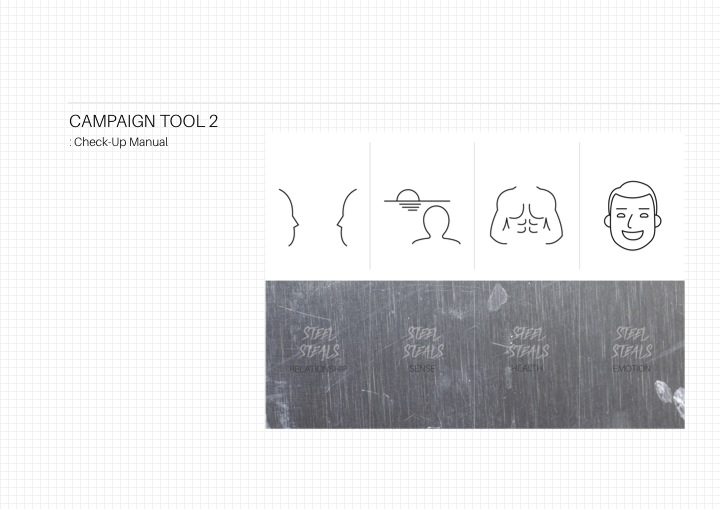
This manual was made to show people the more detailed points that steel steals.
we made this with paper looks like metal texture.
and we designed this manual not using any electronical device, because we wanted to emphasize our message that machines could be harmful to us.
We also wanted people to experience and participate by folding the manual directly.

First, Steel steals relationship from us.
Two people interacting actively changes into indifferent relationship after they are covered with iron plate. Machine stole their communication between them.
At this time we ask,
'Who is a friend?
Phone? or You?

Second, Steel steals sense from us.
The man who was viewing beautiful scenery of sunset changes into the man who is viewing distorted image of that scenery of sunset.
At this time we say
‘your best camera is your eyes.’

Third, Steel steals health from us.
The man with great shape changes into fat guy after taking handle.
At this time we say
‘you’re moving…, but NOT exercising.’

Lastly, Steel steals emotion from us which is essential for humanity.
The smile face is hided by using Machine gradually.
We intend to warn situation that people use laughing emoticon when actually they doesn’t laugh.
This, people deceive emotion of themselves.
so, we say,
emoticon can’t be your emotion.

So this was our research, campaign, and tools for that campaign. Thank you for listening.
2015년 5월 27일 수요일
Assignment : Future of the poster (concept)
I believe the future of the poster lies on these three technologies.
The poster combined with AR, VR and Hololens is my concept of the future poster
1) virtual reality
Virtual Reality (VR), which can be referred to as immersive multimedia or computer-simulated life, replicates an
environment that simulates physical presence in places in the real world or
imagined worlds.
* video clip :
https://youtu.be/9yplHQhaVXU
2) Augmented reality
Augmented reality (AR) is a live direct or indirect view of a physical, real-world
environment whose elements are augmented (or
supplemented) by computer-generated sensory input such as sound, video,
graphics or GPS data.
* video clip :
https://www.youtube.com/watch?v=frrZbq2LpwIV
3) Hololens
Windows Holographic is
a mixed reality computing platform by Microsoft, enabling applications in which the
presentation of virtual elements is incorporated with that of physical
real-world elements such that they are perceived to exist together in a shared
environment
* video clip
: https://youtu.be/3AADEqLIALk
2)XU
2015년 5월 20일 수요일

2015년 5월 12일 화요일
Assignment : Dieter Rams 10 Principles
Dieter Rams Ten Principles of “Good Design”
Good Design Is Innovative : The possibilities for innovation are not, by any means, exhausted. Technological development is always offering new opportunities for innovative design. But innovative design always develops in tandem with innovative technology, and can never be an end in itself.
Good Design Makes a Product Useful : A product is bought to be used. It has to satisfy certain criteria, not only functional but also psychological and aesthetic. Good design emphasizes the usefulness of a product while disregarding anything that could possibly detract from it.
Good Design Is Aesthetic : The aesthetic quality of a product is integral to its usefulness because products are used every day and have an effect on people and their well-being. Only well-executed objects can be beautiful.
Good Design Makes A Product Understandable : It clarifies the product’s structure. Better still, it can make the product clearly express its function by making use of the user’s intuition. At best, it is self-explanatory.
Good Design Is Unobtrusive : Products fulfilling a purpose are like tools. They are neither decorative objects nor works of art. Their design should therefore be both neutral and restrained, to leave room for the user’s self-expression.
Good Design Is Honest : It does not make a product more innovative, powerful or valuable than it really is. It does not attempt to manipulate the consumer with promises that cannot be kept
Good Design Is Long-lasting : It avoids being fashionable and therefore never appears antiquated. Unlike fashionable design, it lasts many years – even in today’s throwaway society.
Good Design Is Thorough Down to the Last Detail : Nothing must be arbitrary or left to chance. Care and accuracy in the design process show respect towards the consumer.
Good Design Is Environmentally Friendly : Design makes an important contribution to the preservation of the environment. It conserves resources and minimises physical and visual pollution throughout the lifecycle of the product.
Good Design Is as Little Design as Possible : Less, but better – because it concentrates on the essential aspects, and the products are not burdened with non-essentials. Back to purity, back to simplicity.
2015년 5월 4일 월요일
Assignment : Protection of copyright for healthier life
The issue of originality in art works has been controversial issue for a long time. Additionally, there were severe debates about should government protect art works' rights by legal force. About this issue, the writer says there are no originality in art works and commercial works in the sense of usage of words and symbols to communicate. Furthermore, he has an opinion that copying doesn't harm who was copied because it is not sure that he could get more money, or more fame.
These opinions seems quite reasonable, but in my thought, they don't make sense in three aspects. First, if artwork has some kind of features of other things, it cannot be called original? For instance, we are all human and we have some kind of common features because we are human. However, can we be called the same person? Absolutely not. That means, having part of something doesn't mean it loses its originality.
Secondly, the writer is underestimating the economical loss by plagiarism. It even seems he is ignoring the negative side of plagiarism on purpose. There are numerous examples of how plagiarism can devastate original works' owner, and get profit in appropriate ways.
Third, the writer says thanks to development of IT, plagiarism has lost its power because of the individuals' power. However, is it really true? There are many people using illegal copied contents like megafile, wedisk, and etc.. This makes artists hard to make living and demotivated, which results in negative effects on art-producing ecosystem.
In some aspects, the writer's opinions make sense. The era is changing and we are now right in front of the most successful technology based society, and for that, redefinition of plagiarism and copyrights seems quite reasonable. However, the writer's opinions seem unreasonable. In order to make our society healthier in another aspect, artists' copyright has to be protected in various ways.
2015년 4월 30일 목요일
Midterm Presentation : Thousand Locks, Thousand Memories, Namsan tower
1) purpose and concept of the project
We pass by various places in this city living our life. Some places are public places which are opened to many people. On the other hand, there are some kind of private places which is only for specific person, and specific purpose.
However, what if public place could become private place, or what if private place could become public place simultaneously, by doing some action in that place, to be more specific, interact with that place? Our project started with this question.
Namsan tower, lies in the middle of Seoul city, which makes it possible to be opened to all four directions. Furthermore, it is really popular place for both native Koreans and foreign travelers. That's why we thought Namsan tower could be seen as one of the most public place in Seoul city.
At the same time, we thought Namsan tower also could be private place because of the locks on the fence. It is because 'lock' is the symbol of privacy, containing private memories of each couple who are in various phases of love.
Therefore, we planned to take a video clip which informs four private ways to get to the locks in Namsan tower, for each couple in three different phases of love and additionally, singles.

As you can see on the map, there are four routes to get to the namsan tower. First, starting from hannamdong. Second, starting from Myeongdong. Third, starting from Namsan library. Fourth, taking bus from Myeongdong. From now on, we'll gonna introduce you each way for lovers who are in different phases of love
1) Loocking for love!
Hannamdong is famous for its delicious and fancy restaurants and cafeterias. When you are looking for someone to love, and wishing that person to be your lover, maybe you can start from hannamdong and get to the namsantower. And then, you can propose her to be your girlfriend surrounded by romantic locks
2) Let's Lock and Love!
Myeongdong is really crowded area in Seoul. There are many shopping spots, delicous street foods and fancy cafeterias. If you want to go out with your lovely girlfriend, and enjoy delightful date with her, we recommend myengdong route to get to the namsan tower.
When you get to the namsan tower, you can buy a lock to hang it on the fence. Many people from all around the Korea, and all around the world will do this things, and look at this, these are all their symbols of love which contain their private memory between just two people. There lies thousand locks and therefore, there lies thousand memories in Namsan tower. This makes this place both public and private place in Seoul city.
3) Lack of love
Namsan library route is calm and quiet way to get to the namsan tower, compared to Myeongdong and Hannamdong route. Therefore, we thought this way fits well to the couples who are in the phase of 'Lack of love' Why don't you guys take this route and go back to the place where you locked your lock together?
The lock they hung on the fence is not just the lock itself, but it is the symbol containing the memories of their love. They came to realize that although their love is now just having hard times, It cannot deny their history and memories of love for past years. The lock gives them back their private memories, and makes Namsan tower, the public place of Seoul into private place for them.
And bonus.. singles!
This route is for singles who doesn't have to enjoy something. Their first priority is to get to the mountain as fast as possible, and get rid of all the locks on the fence. Therefore, we recommend them to get on the bus in myeongdong, and go straight forward to the top of the mountain!
3) Closing..
Once again, we pass by various places in this city living our life. By going through this project, we came to realize we also got the private memory for Namsan tower, and it couldn't be what it had been before anymore. Although place itself is still the same, as far as there are people interacting with that place, it changes its identity continuously. Thank you :)
2015년 3월 30일 월요일
Assignment 3 : Good Place & Bad Place
Bad Place : Gwanjung library lobby on 7th floor

This is an outlook of the lobby on 7th floor. It looks quite nice when you just see this without any thinking.
 However, if you look into this pond, it is really dirty. Because water is not flowing, water inside is really dirty and smells bad. This doesn't give fresh feeling to someone who is taking a rest while studying.
Secondly, It makes people who try to take some rest, hard to sit on. There is water right behind someone is sitting, so he can't lean behind his back.
Therefore, the pond is just taking a lot of place which could be decorated with comfortable couches or tables.
 Moreover, there's even worse thing. Can you see that tree on the bench? It is really wired.
Introduction in the picture says this is the tree which were growing in the library's site. It insists that by putting that piece of tree, we can feel nature inside the library.
Well, in my thought, if they really wanted to bring the nature inside the library, they could do other things! Putting piece of dead tree on the bench doesn't make people think they are near the nature.
Good Place : Jahayeon
According to the article, place is not just the place itself, but also the interaction between its users and itself.
 In this perspective, I chose Jahayeon as good place. We take it for granted Jahayeon being in this place because 'it has been there' since we entered the school, but what if there were buildings instead of Jahayeon? Maybe, these buildings will block the sight of people who are walking down from the liberty plaza or who are walking straight from the student union to college of business administration building.
 Not only Jahayeon itself makes campus more beautiful, but also makes kind of plaza area, which makes people to interact in the middle of the campus. It can be seen interactive, because the place is creating somekind of symbol, like the heart of the campus.
2015년 3월 25일 수요일
Assignment 2: What is Good Design?
"What is Good Design?"
This is one of the questions which made me to start minor in design. I tried to find out the answer for this question because my final dream is to found a global culture platform company which is good for myself, workers, customers, and world (I was quite surprised because writer mentioned about this virtue similarly). For this objective, I had to know what is good design, because design is really important as much as managing and developing technologies.
So, what is good design? In logic, to define what is good, there has to be criteria to determine what is good. Therefore if I could define what is the criteria to determine what is good design, I would be able to define what is good design.
In that point, "How good is good?" doesn't suggest criteria of the good design. It only shows how bad design ruins our life, and how good design makes our life healthier. However, the essential idea of the essay gave a good point of view that just pretty eye-catching things could not be called good design.
In this perspective, I established six criteria for good design. I will call it SFHEAD!
1. Striking : good design has to carry strong message.
2. Friendly : good design has to be friendly to users.
3. Historical : good design has to have meaningful historical context.
4. Economical : good design has to save resources and efficient.
5. Aesthetic : good design has to be beautiful.
6. Durable : good design has to be strong.
In my thought, good design doesn't have to meet all criteria simultaneously (and it seems impossible). Rather than that, designer has to determine which criteria is most important among six criteria. Then he can start designing keeping in mind the concept of design.
In this perspective, I chose monami pen for good design. Monami pen, which has been steady seller for long time ago, has strong points in durable, Economical, Friendly criteria. Also, they deliver the message to us that this pen is only concentrating on function itself! At that moment, this pen looks even aesthetic and this made monami pen obtain historical context by being sold steadily for about 30 years.
However, obbadak calendar, which I chose for bad design, shows none of these criteria acquired properly. It is not aesthetic, and carries no message about their products! It is wholly covered by good-looking man which I cannot understand why this is related to fried chicken advertisement.
2015년 3월 19일 목요일
Assignment 1 : Punctuation mark

I concentrated on three keywords while I was designing this punctuation mark.
1) Emotional
I thought there already exists many functional punctuation marks. Therefore, I tried to design punctuation mark which can help describing someone's feeling effectively. Then, I came to realize that there are no punctuation mark related to sad feelings(We use " ! " to express positive feelings like, I feel good today!, I'm really excited!).
2) Simple
When I pondered on this subject, I came to realize that all punctuation marks are designed in just 2 lines. Maybe it is because, in order to use it when we are writing a sentence, punctuation mark has to be simple!
3) Intuitive
Also I could find the fact that, most punctuation marks were designed intuitively.
As a result, I made a punctuation mark with 2 lines going downward. I tried to symbolize tears flowing down by drawing 2 lines going downward. Thank you!
피드 구독하기:
덧글 (Atom)